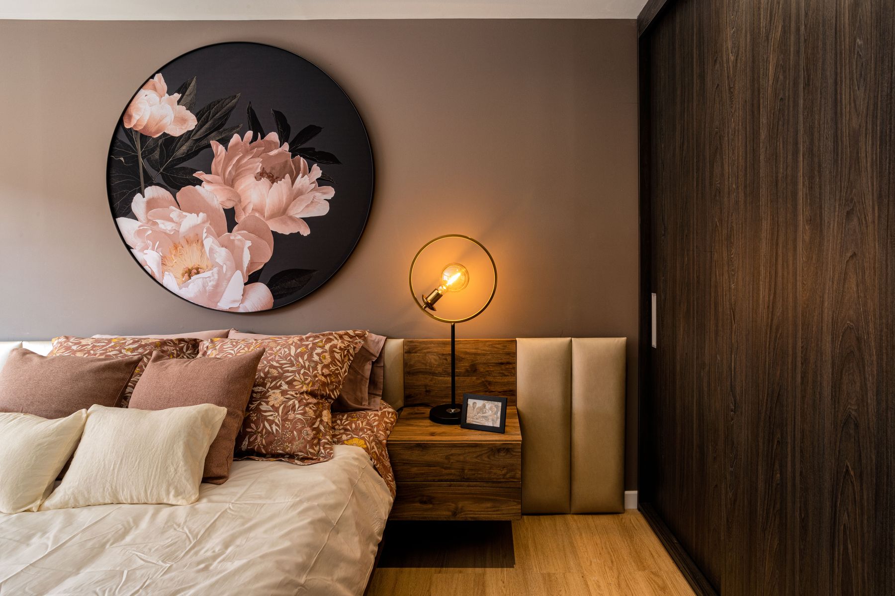
The bedroom is the most personal room in the house, and the color you put on the walls is the single biggest decision you will make in it. The wrong color makes the room feel like a hotel room you cannot relax in. The right color makes the room disappear when you close your eyes — and look like a room you actually want to be in when you open them.
We have watched color palettes move from cool gray on cool gray (everyone's 2015 bedroom) through warm greige (the late 2010s) into the more textured palettes we see today: warm whites, earth-toned greens, terracotta-adjacent reds, deep aubergine retreats, and quiet biophilic blues. This guide is built around what each palette does to a room and which one fits the way you sleep.

Why Bedroom Color Is Different
A living room color asks to be seen. A bedroom color asks to support how you sleep. That changes the priorities: light reflection, perceived warmth, and the way the color reads at night under warmer light sources.
Most paint brands — Benjamin Moore, Sherwin-Williams, Farrow & Ball, Behr — keep a small set of colors specifically designed for restful rooms. They tend to be lower chroma (less saturated), warmer, or earth-toned relative to the same hue at full saturation. Benjamin Moore's White Dove, Sherwin-Williams' Alabaster, and Farrow & Ball's Ammonite are all reference points for warm whites that read neutral but feel soft.
The color on the swatch is roughly 20 percent more saturated than it will look on a wall. Always sample a paint chip in the actual room at two times of day — late morning and evening under lamplight — before committing.
The Calming Palette: Warm Whites and Quiet Neutrals
If you sleep best in a quiet space, you want a palette built around warm whites, off-whites, and quiet greiges. The walls carry a low-saturation color, and you layer subtle texture in linen, oak, or aged brass through the textiles.
The reference colors:
- Benjamin Moore White Dove (OC-17) — a warm white with just enough cream to read as soft in any light.
- Sherwin-Williams Alabaster (SW 7008) — slightly more neutral than White Dove, holds up against warm wood tones.
- Farrow & Ball Ammonite (No. 274) — a sophisticated greige with green and gray undertones.
- Behr Silver Drop (790C-3) — a budget-friendly soft greige that reads warm against natural light.
A working palette built around White Dove looks like: White Dove on the walls, a darker greige (Benjamin Moore Cedar Key or Pale Oak) on the trim or ceiling, oak furniture, soft linen bedding in oatmeal or sand, and one or two accent pieces in a darker hue for visual weight — black, deep navy, or oxblood.
A working palette built around Ammonite looks like: Ammonite on the walls, drop ceilings in a flatter white (Benjamin Moore Decorator's White), brushed nickel hardware, eucalyptus or fern motifs in the soft goods, and a single darker accent wall in olive or charcoal.
Warm whites amplify daylight without harsh reflection. They also age better than cool whites, which is why bedrooms in 1995 beige still feel okay, while 2015 cool gray bedrooms feel institutional.
The Moody Palette: Deep Color as a Backdrop
If you sleep well in a cave-like room, or you want the bedroom to feel cocooning rather than airy, a moody palette is the move. Walls go dark — navy, charcoal, aubergine, forest green, oxblood — and the rest of the room builds in lighter shades that let the walls do the work.
The reference colors:
- Farrow & Ball Inchyra Blue (No. 289) — a deep navy with green and gray notes.
- Benjamin Moore Hale Navy (HC-154) — a slightly warmer navy that reads coastal but still dignified.
- Sherwin-Williams Urbane Bronze (SW 7048) — a sophisticated dark bronze.
- Farrow & Ball Studio Green (No. 93) — a deep, slightly desaturated green that ages into a richer finish.
- Benjamin Moore Newburyport (HC-155) — a deep oxblood that reads almost black in low light.
A working deep-navy palette: Hale Navy on the walls, ceiling in a flat white for breathability (a moody ceiling reads heavy and can make a room feel claustrophobic), warm wood furniture in walnut or oak, and bedding in cream or oatmeal to keep the room from going monochrome-dark. Hang heavier curtains in a deeper ivory or stone for window softening.
A working forest-green palette: Studio Green on a single wall (the headboard wall is the natural place), the other three walls in a soft putty like Farrow & Ball Drop Cloth (No. 47), warm metals like antique brass on the hardware, and linen bedding in cream or stone.
The mistake with moody palettes is going all-dark. A bedroom with dark walls, dark ceiling, dark floor, and dark bedding feels like a tunnel. Lift one element — ceiling, bedding, or floor — to keep the room habitable.
The Warm Palette: Terracotta, Rust, and Clay
Warm earth-tone palettes have made a real comeback. They work in bedrooms where the goal is restful warmth, not crisp minimalism. The reference colors lean into the orange-red family at low saturation.
The reference colors:
- Farrow & Ball Book Room Red (No. 50) — a deep terracotta that reads terracotta in some lights and oxblood in others.
- Sherwin-Williams Cavern Clay (SW 7701) — a soft, warm clay.
- Behr Red Pepper (180B-7) — a vibrant but earthy terracotta.
- Benjamin Moore Potters Clay (CW-345) — a true clay color, sophisticated at full saturation.
- Farrow & Ball Picture Gallery Red (No. 41) — a more daring terracotta for an accent wall.
A working terracotta palette: Potters Clay or Cavern Clay on a single accent wall behind the bed, the other walls in a warm white (Alabaster or White Dove), bedding in cream or sand, pillows with a small-scale kilim or stripe pattern, and warm metals on the nightstand lamps. Real terracotta, natural rattan, and unpolished wood all read as native to this palette.
The mistake with terracotta palettes is going too saturated. Book Room Red on four walls at night is oppressive. Confine the warm color to one wall or a fireplace surround and let the rest of the room breathe in soft warm whites.
The Biophilic Palette: Greens, Blues, and Sand
Biophilic palettes borrow colors from the natural landscape outside. They work in bedrooms with strong views, in any room that connects to a yard or park, and in any home where the goal is to bring the outdoors in.
The reference colors:
- Farrow & Ball Pigeon (No. 25) — a sophisticated blue-gray that reads blue at noon and gray at dusk.
- Benjamin Moore October Mist (1492) — a soft sea-green, very on-trend.
- Sherwin-Williams Retreat (SW 6207) — a saturated but soft forest green.
- Behr Blueprint (S470-5) — a denim blue with subtle saturation.
- Farrow & Ball Treron (No. 292) — a deeper sage, neither too green nor too gray.
A working green-biophilic palette: October Mist or Farrow & Ball Card Room Green on the walls, ceiling in flat white, bedding in oatmeal or stone, drapery in a soft cream linen, and wood furniture in white oak. Live plants — pothos, fern, fiddle leaf fig — finish the look.
A working blue-biophilic palette: Pigeon or Blueprint on the walls, ceiling in flat white, bedding in cream, throws in soft cream or sand, and one darker navy pillow for depth. The room reads coastal without leaning into nautical overload.
The mistake with biophilic colors is going so desaturated the room feels like an office. If the color has to fight to be seen, it is too quiet. A little saturation in the wall color helps the palette feel intentional rather than accidental.
Picking a 2026 Direction
Three palettes are doing the most work in current bedrooms.
Soft warm whites with textural contrast: White Dove walls, deeply textured linen bedding, raw oak furniture, hand-thrown stoneware, and a single saturated piece — a piece of original art, a vintage rug, or one deeply colored headboard. The room reads quiet but has presence.
Quiet earthy greens: October Mist, Farrow & Ball Treron, or Sherwin-Williams Retreat in the deeper form, paired with warm woods, cream stoneware, and brushed brass. The room reads warm and restful without being neutral.
Cocooning dark retreats: Studio Green, Inchyra Blue, or a deeper oxblood like Newburyport on a single wall, with the surrounding walls and ceiling in soft warm whites and bedding that lifts to cream. The room reads moody but not overwhelming.
What is fading: cool gray on cool gray (still everywhere from the late 2010s, dated now), stark greige-on-white minimalism (works in galleries, not bedrooms), and overly saturated accent walls that fight the rest of the room.
Accent Combinations
Three accent moves work in most bedrooms. Each adds depth without overcomplicating the palette.
The single dark accent: A pair of nightstands in a darker stain (walnut, ebony), or a single piece of original art in deep navy, burgundy, or forest. The room reads calm and intentional.
The warm metal shift: Switching all metal hardware — drawer pulls, lamp bases, ceiling fixtures — to antique brass, brushed brass, or unlacquered brass. This small move ties wood tones and warm whites together in a way chrome cannot.
The textured bedding lift: Bedding in nubby linen, vintage-washed cotton, or chunky wool that picks up the wall color but pushes it in a new direction. A linen duvet in cream over an oatmeal wall gives the room more depth than solid-color bedding.
Common Bedroom Color Mistakes
The most common errors are universal:
Cool gray walls without warm accents reads institutional. If you want gray, pair it with warm wood, brass, or copper. Cool gray walls, chrome hardware, and white bedding are a recipe for a sterile bedroom.
All-moody rooms lose their contrast and read as cave-like. Pick one element to lift, almost always the bedding or the ceiling.
Forgetting undertone. The same beige can look pink, yellow, or green depending on the undertone. Sample paint chips in the actual room, next to the bed and the curtains, before ordering.
Skipping the ceiling. A flat white ceiling lifts any palette. A colored ceiling — even a "lighter version" of the wall color — closes the room in. Bedrooms with colored ceilings sleep worse than bedrooms with white ceilings.
Buying paint from a photo or a screen. Paint chips are flat and reads cold. Use real swatches taped to the wall for at least 24 hours before committing.
Practical Tip on Sampling
Buy three samples of any color you are considering, paint a 12-by-12 square on each of the walls where it will live, and look at them at two times of day — natural daylight and evening lamplight. Most paint brands sell 8-oz sample pots for $5 to $10, and they save you hundreds in wrong decisions.
For bedrooms specifically, keep the swatch on the wall for at least two nights. You will know whether the color helps you sleep or fights you within a week.
The bottom line
A bedroom palette works when the walls do the supporting work and the textile-and-furniture layer does the visual work. Start with a warm white, an earthy green, or a deep blue, lift one element out of the dark, and bring in real wood and brass so the room feels inhabited rather than decorated.